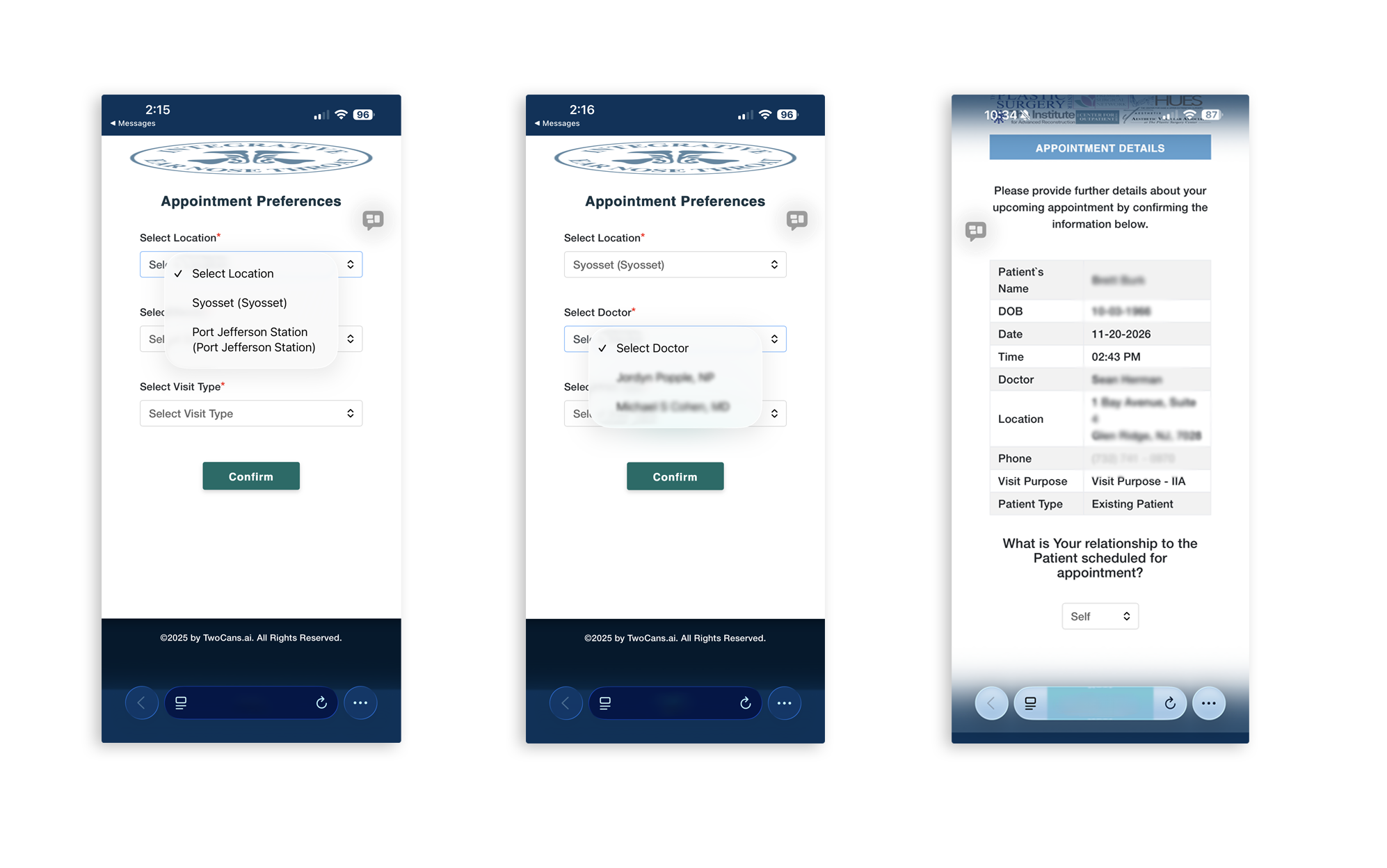
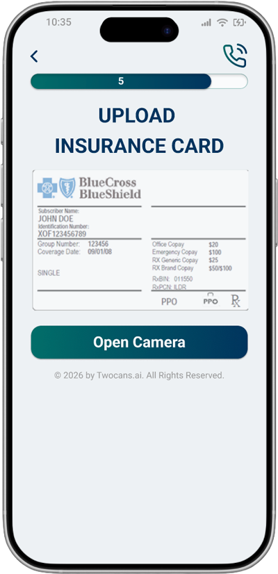
Old user interface.
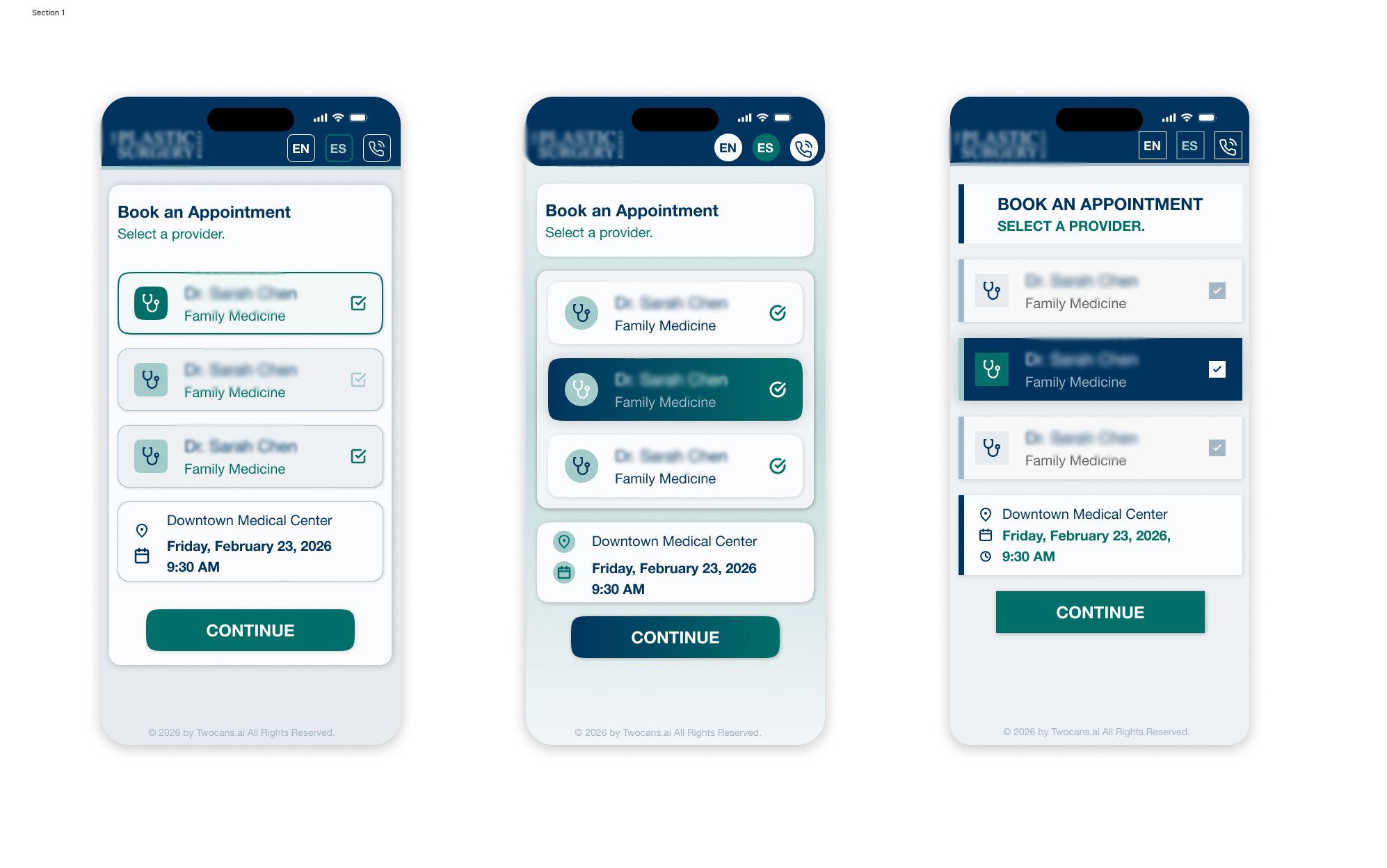
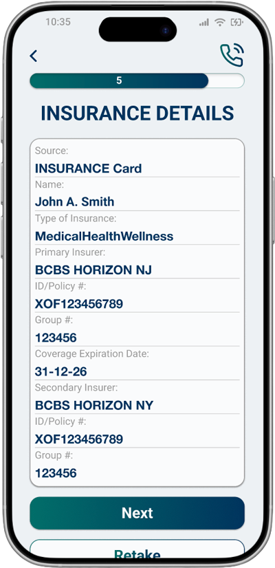
New proposed interface.

Old user interface.
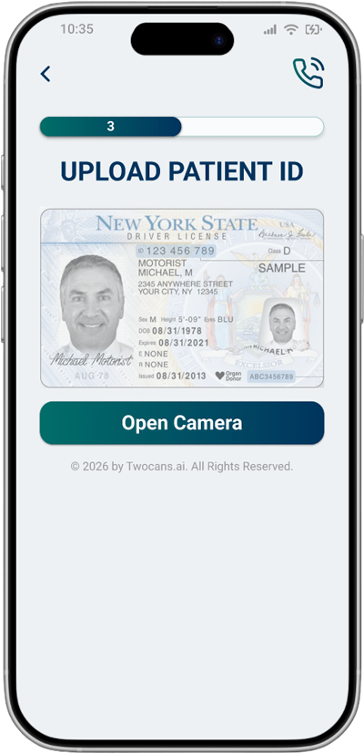
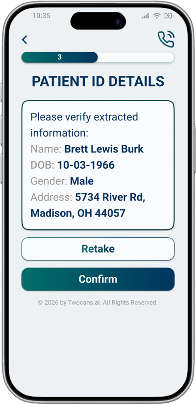
New proposed interface.